
Introduction: History of Responsive Web Design
Responsive web design is a design method that mainly targets the layout of the website, or web page, to render equally well on any device or screen size.
The first person to introduce the idea of Responsive Web Design was Ben Dowling in 1993 with his description of “fluid” layouts. He argued that content should be able to flow across all devices without having to worry about how it would look on each one. He also made mention of the browser’s window size as being fluid – this isn’t responsive web design because it needs 2 different breakpoints, not just 1.
How the Transformation to RWD Affected User Experience
The design of a website is responsible for how it will perform on different devices and screen sizes. This is why with the transformation to RWD, responsive web design has been a popular decision in the digital landscape.
The goal with responsive web design is to create a website that can be viewed on any device with ease. A user should be able to access the same information regardless of what size their screen is.
What are the Best Techniques for Creating a Successful Responsive React Native App?
Building a responsive web app is no easy feat. To design a website to work on all devices, you need to know the best practices for responsive application, the best techniques for producing successful responsive web design, and how to use these techniques in your React Native app.
Responsive web design is an important technique to consider when building a responsive app.
It will allow you to create an experience that is simple and intuitive regardless of the device or screen size.
The following are some of the most basic practices for producing a successful responsive web design:
-Making sure your application conforms to the various devices and screen sizes
-Designing layouts with fluid grids
-Using media queries
-Using relative units for font sizing
How to Create Responsive Layouts in React Native Apps

The New King of Mobile App Development: React Native
React Native is an open-source framework for building mobile apps using JavaScript.
The main benefit of using React Native is that it allows developers to build native apps using JavaScript, which makes the process smoother and more efficient.
React Native helps developers save time by reducing the number of lines of code they have to write. In addition, they can write apps that are cross-platform and work on both iOS and Android with just one codebase.
Responsive Design and What it Means for Your App
Responsive app design is an extension of responsive website design and it’s used to create apps that will work on any device, regardless of its size or orientation.
Responsive app design is a revolutionary new take on traditional app development, as it makes apps that can automatically adjust to the device they’re being viewed on. This removes the need for developers to create multiple versions of an app for different screen sizes, meaning that there’s less clutter and more focus on a single user experience.
Mobile-First Development and How it Relates to Responsive Layout
Responsive design is a web design technique that aims to provide an optimal viewing experience by adapting the webpage layout according to the device used to access it.
Mobile-first design is a technique that has gained popularity in recent years and it has been gaining more and more traction as we move forward. It is essentially a strategy for web development which is focused on designing and developing mobile-friendly websites first, before proceeding to develop for other platforms.
What is a Framework and Why You Should Use One to Create Your Apps?
Frameworks are a set of pre-built components that you can use to design your mobile application. They offer a lot of reusable functions and components that you can just plug into your project without the need to write the code from scratch.
The most popular frameworks for React Native app development are React Native, PhoneGap, Ionic and Xamarin.
How to Choose the Best Framework for Your React Native Project?
React Native is an open source framework that helps you build mobile apps using JavaScript and React. It has a vast library of components and modules that allow developers to use the same set of tools for cross-platform app development. It also allows UI components to behave natively on each platform, making the apps feel like they were built from scratch for it.
The React Native community is so strong and there are numerous resources available online in case you get stuck or need help with something. There are also several tutorials and full-fledged courses (both free and paid) to help you learn how to use it.
When it comes to building interactive applications with React, the most common framework for developing user interfaces is ReactJS. But there are some other options available for React Native apps.
One of the most popular choices is to use D3js. So let’s take a look at how to work with this powerful JavaScript library in React Native apps.
D3js is one of the most popular choices for data visualization in React Native apps. It’s an amazing tool that can be used to create beautiful, interactive data graphics. In this post, you’ll see how to work with D3js in your React Native app.
D3js is an interactive data visualization library that has become the go-to for developers building data graphics in React Native apps. It’s a powerful and flexible solution that offers endless potential and possibilities, and can be used to create everything from simple charts to complex data visualizations with animation and interaction.
Responsive layouts are the key to successful interactive applications. However, they are not that easy to create. They need to be recalculated every time the screen size changes.
React Native provides the perfect solution for responsive layouts with its flexbox-based layout engine, FlexboxLayout. This allows you to create responsive layouts dynamically at runtime and get rid of all the headaches that come with dynamic layouts in other technologies like CSS or Flexbox in HTML.
ERP vs CRM: Key Differences, Strengths, and How Clavis’ ERP Drives Organizational Success
In the digital age, businesses strive to leverage advanced tools to streamline operations, boost productivity, and foster better customer relationships. Two pivotal software solutions that play a significant role in achieving these goals are Enterprise Resource Planning (ERP) and Customer Relationship Management (CRM) systems. While these tools may seem similar at first glance, they serve distinct purposes and offer unique benefits, and it is important to understand why you may need one or the other—or both in tandem.
1. What is ERP?
ERP stands for Enterprise Resource Planning, a comprehensive software suite that manages and integrates core business processes. These processes often include:
- Finance and accounting
- Human resources
- Supply chain management
- Inventory and order management
- Manufacturing
ERP systems centralise business data, allowing various departments to collaborate seamlessly and make informed decisions based on real-time insights.
Core Features of ERP Systems
- Centralized Data Management: Consolidates information from all business departments into one platform.
- Process Automation: Automates repetitive tasks to improve efficiency.
- Scalability: Can grow with your business, accommodating new functionalities as needed.
- Compliance Support: Helps organisations meet regulatory requirements.
- Advanced Analytics: Provides detailed insights to support strategic decision-making.
2. What is CRM?
CRM, or Customer Relationship Management, is software that focuses on managing a company's interactions with current and potential customers. The primary goal of a CRM system is to improve customer satisfaction, retention, and acquisition through personalised communication and efficient management of sales and marketing activities.
Core Features of CRM Systems
- Contact Management: Maintains detailed records of customer interactions and preferences.
- Sales Pipeline Tracking: Manages leads and monitors the sales process.
- Marketing Automation: Facilitates email campaigns, social media management, and more.
- Customer Support: Enhances post-sale services through ticketing systems and live chats.
- Data-Driven Insights: Helps identify trends to fine-tune marketing and sales strategies.
3. ERP vs. CRM: Key Differences
While ERP and CRM are essential for business success, they cater to different aspects of operations.
|
Feature |
ERP |
CRM |
|
Primary Focus |
Internal processes and operational efficiency |
Customer interactions and relationships |
|
Key Functions |
Accounting, supply chain, HR, inventory |
Sales, marketing, customer service |
|
Target Audience |
Internal stakeholders |
Sales, marketing, and customer support teams |
|
Data Integration |
Focuses on consolidating operational data |
Specialises in customer-centric data |
|
Scalability |
Enterprise-wide |
Primarily focused on customer management |
4. The Strengths of ERP Systems
ERP systems are the backbone of operational efficiency. Their key strengths include:
- Holistic Business View: ERP provides a comprehensive view of business operations by integrating data across departments.
- Cost Reduction: Automating processes reduces manual labour and errors, saving time and money.
- Improved Compliance: Centralized data simplifies regulatory reporting and ensures adherence to standards.
- Inventory Optimization: Enhances inventory management, reducing waste and ensuring timely procurement.
- Agile Decision-Making: Real-time data insights help leaders make swift, informed decisions.
5. The Strengths of CRM Systems
CRM systems shine in the realm of customer relationship management, with benefits such as:
- Enhanced Customer Insights: Tracks and analyses customer preferences to tailor interactions.
- Improved Customer Retention: Personalization and timely communication foster loyalty.
- Streamlined Sales Processes: Automates lead management, reducing manual intervention.
- Marketing Optimization: Helps segment audiences for targeted campaigns.
- Boosted Collaboration: Facilitates alignment between sales and marketing teams.
6. ERP and CRM: Complementary Tools
Though distinct, ERP and CRM systems are complementary and often integrated to deliver maximum value. For instance:
- CRM manages the front-end relationship with customers, while ERP handles back-end processes like inventory and order fulfilment.
- Together, they provide a seamless flow of information, ensuring that customer-facing teams have accurate, up-to-date data on orders and services.
7. Clavis' ERP: The Ultimate Solution for Organizational Success
Clavis' ERP stands out as a robust ERP solution designed to address the multifaceted needs of modern businesses. Here’s how it can drive your organisation's success:
a) Comprehensive Integration
Clavis' ERP integrates seamlessly with existing systems, including CRM platforms, to unify your business processes.
b) Real-Time Data Analytics
With Clavis' ERP, decision-makers can access advanced analytics tools that offer actionable insights into performance, trends, and potential opportunities.
c) Tailored Functionality
Highly customisable to suit the unique needs of businesses across industries, Clavis' ERP works for all—from manufacturing to retail and more.
d) Enhanced User Experience
The platform boasts an intuitive interface, making it easy for employees to adopt and use effectively.
e) Cloud Capabilities
Leverage cloud-based deployment for flexibility, scalability, and cost savings.
9. Choosing the Right Solution for Your Business
When deciding between ERP and CRM—or opting for an integrated approach—consider the following:
- Business Goals: Identify whether your primary focus is operational efficiency (ERP) or customer relationships (CRM).
- Scalability: Choose a solution that can grow with your business.
- Budget: Evaluate the total cost of ownership, including deployment and maintenance.
- Customization: Ensure the platform can be tailored to your specific needs.
Final Thoughts
ERP and CRM systems are indispensable for businesses aiming to optimise operations and enhance customer relationships. While they serve distinct purposes, their integration offers unparalleled value. With Clavis' ERP, you gain a robust tool that streamlines your operations and integrates seamlessly with CRM systems to provide a holistic business solution.
Some other posts you might be interested in.

AI + RPA: The Ultimate Duo to Scale Your Business Faster and Smarter
Scaling a business isn’t just about doing more—it’s about doing more intelligently. As digital transformation redefines the modern enterprise, two technologies have emerged as transformative powerhouses: Artificial Intelligence (AI) and Robotic Process Automation...
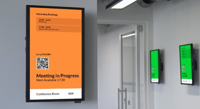
Effortless and Effective Digital Signage for Every Organization with Clavisign
Explore how digital signage from Clavisign is transforming business communication and engagement.

15 Applications of Blockchain in Healthcare
"Blockchain" refers to a shared irreversible record of a chain of transactions, each of which is made up of one block, and which is held together by cryptographic keys ("hashes"). These keys or signatures are maintained in shared ledgers and connected by a network of...